
George’s Intro
I updated this post in 2026.
A yoga flyer is not a magic spell with a QR code.
Its job is smaller and more useful: help one suitable person notice one class, understand the practical details and take one clear next step.
I’m George, a BWY yoga teacher, creator of the Online Yoga Lesson Planner, yoga card deck maker and enthusiastic sticky-note doodler.
Jump to the Yoga Flyer Checklist ↓
What I Actually Did
I created editable yoga flyers in Microsoft Word for my own classes, including A4, A5 and A6 versions. The software was ordinary. The important part was leaving the computer.
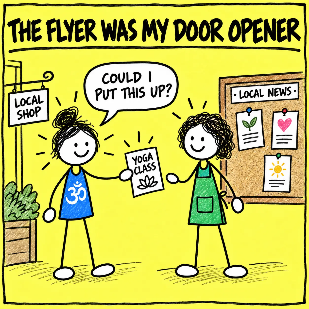
I would visit dozens of businesses near the venue, introduce myself as the local yoga teacher and ask whether they would display the flyer. I did not simply hand over a mysterious piece of paper and flee. I explained why the class could be useful to their employees: a regular wellbeing break, gentle movement after sitting or standing at work, time away from screens and a friendly shared local activity.
That short conversation mattered. The flyer opened the door; a real person made it credible. Blue tack assisted, but it was not asked to carry the entire marketing strategy.
What Should a Yoga Flyer Achieve?
A flyer should earn enough attention for the right reader to understand the offer. It does not need to teach the history of yoga, display seven logos or accommodate your entire professional autobiography in eight-point type.
The person may see it on a café board, take it from a clinic desk or receive it after class. In each case, they need the same answers: Is this for me? Where and when is it? What does it cost? What should I do next?
8 Steps To Design A Yoga Flyer That Gets Read
Make the useful details easy to spot.
The first four steps choose the class, reader, essential details and honest benefit. Steps five to eight design for a quick glance, choose the placement, start local conversations and track a small test.
Choose One Class and One Job
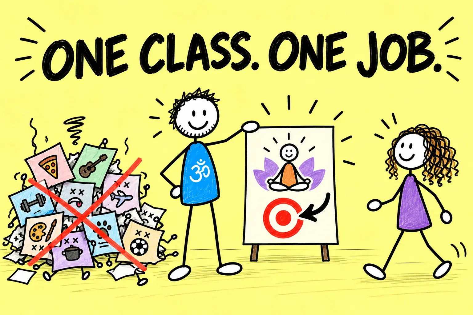
Begin with one offer.
A flyer for “everything I teach” usually becomes a small yellow directory. Choose one class, course, workshop or introductory offer and decide what the flyer should help the reader do.
- Book a beginners’ course
- Visit one class-information page
- Call or email with a question
- Scan a code for dates and availability
- Collect an introductory pass
- Join a clearly described local event
Give the flyer one primary action. If the goal is to fill Thursday’s beginners’ class, the sunrise retreat, teacher training and six card decks can wait for another piece of paper.
One-flyer ruleOne class. One suitable reader. One next step.
Write for One Real Local Reader
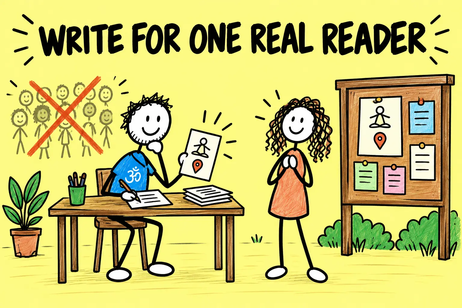
Picture the person who will pause at the noticeboard.
They may be a complete beginner, a nearby office worker, an older adult looking for a gentler option or an existing student interested in a workshop. Use words that help that person recognise the fit.
“Beginners’ yoga in Cardigan on Thursday evenings” is usually more useful than “Awaken your infinite luminous essence.” The second may be beautiful. It is less helpful when somebody mainly needs to know whether there is parking.
Use a specific headline
Class + audience or situation + place or time
Beginners’ Yoga in Cardigan
Gentle Chair Yoga for Older Adults
After-Work Yoga on Tuesdays
Do not rely on the word “YOGA” alone. It names the activity but does not explain which class the reader has found.
Add the Details Needed for a Decision
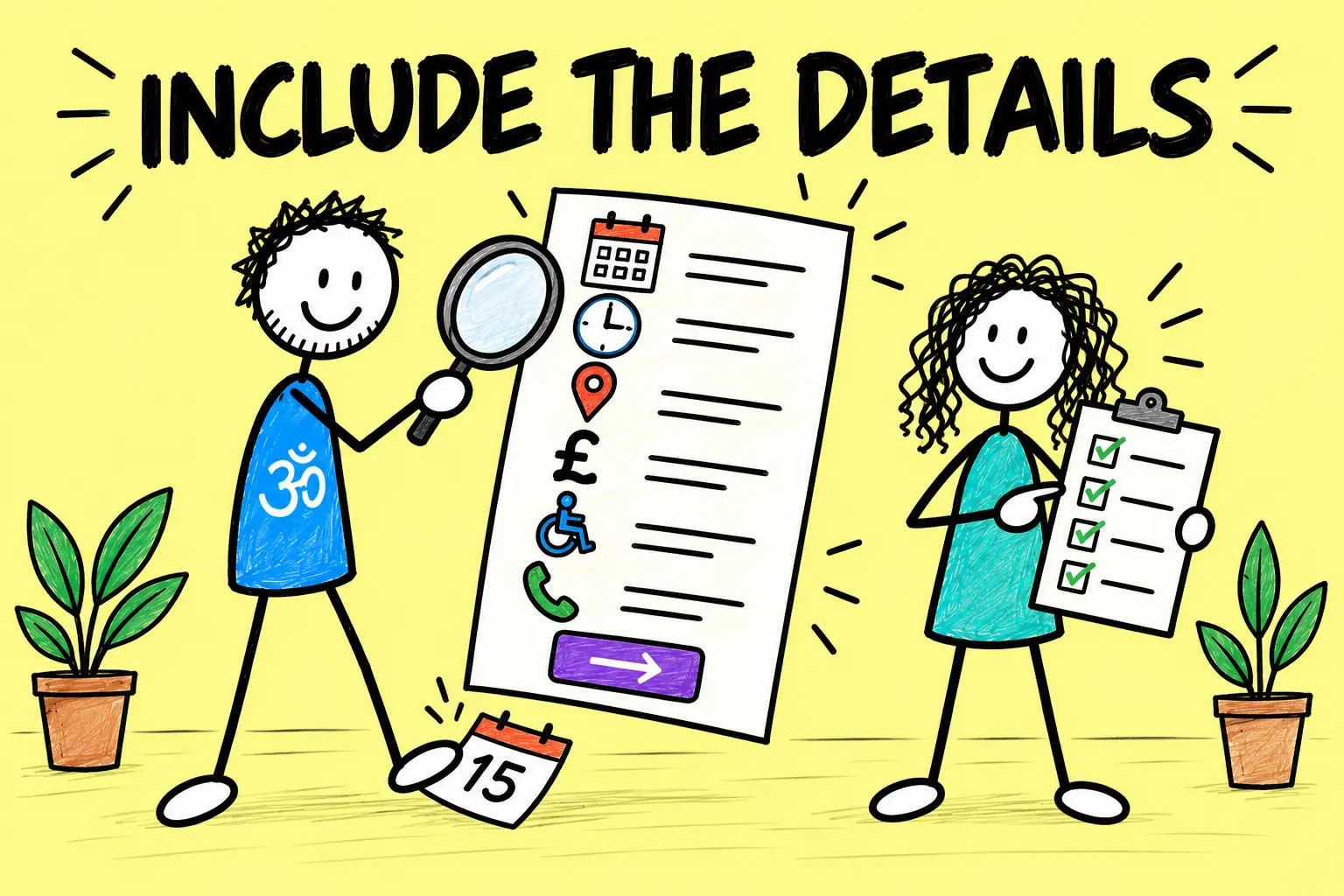
A beautiful flyer with a missing date is modern art.
Before choosing colours, collect the information a new student actually needs:
- Clear class name
- Who the class suits
- Day, date and time
- Duration and course length
- Venue name and full location
- Price and what it includes
- What to bring or wear
- Accessibility information
- Teacher’s name and relevant qualification
- Booking link or contact route
- Cancellation or important conditions
- A date for checking the information
Use a short web address or QR code for fuller details, but keep the essential promise and action visible on the flyer. Test every code and link on another phone. The QR code has no spiritual obligation to work merely because you centred it beautifully.
Practical testCould a stranger decide whether the class suits them without finding you first?
Explain the Benefit Without Making a Miracle Claim

Connect the class to a believable reason for attending.
When I approached local businesses, I explained why the class could be relevant to their staff rather than only asking for noticeboard space. Depending on the class, that might be a friendly local wellbeing activity, gentle movement, time away from desks and screens or a regular shared break.
Use language that describes the class and experience you can genuinely provide. Avoid promising that yoga will cure a condition, prevent injury, guarantee weight loss or double somebody’s income.
The UK CAP Code on misleading advertising says marketing must not materially mislead and that objective claims need evidence before publication. Its health-related advertising rules also require objective health claims to be supported by evidence.
That is why this rebrand removes my old “double your class size” headline. A flyer can support a good local marketing effort. It cannot sign a results guarantee while nobody is looking.
Design for a Five-Second Glance
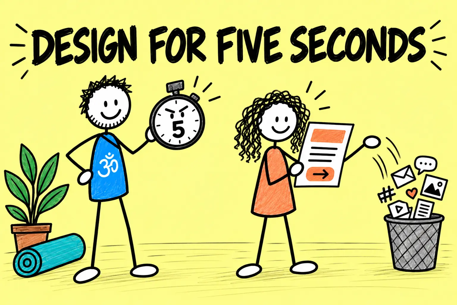
Create a clear reading order.
The eye should find the headline first, the key details second and the action third. Use one or two readable typefaces, short sections, generous space and strong contrast. Red is a colour, not a marketing strategy.
- Make the headline the largest text.
- Keep body copy comfortably readable at the final printed size.
- Align related details instead of scattering them around the page.
- Use one useful image rather than a yoga-pose stampede.
- Keep text away from trim edges.
- Print a test copy before ordering a stack.
Although written for digital content, the W3C’s contrast guidance explains the underlying accessibility point: sufficient light–dark contrast makes text easier to read, including for people with reduced vision or colour-vision differences. For print, test the real paper copy in ordinary lighting rather than trusting a glowing screen.
Five-second testShow the flyer briefly. Can somebody recall the class, place and next step?
Choose the Size and Placement Together
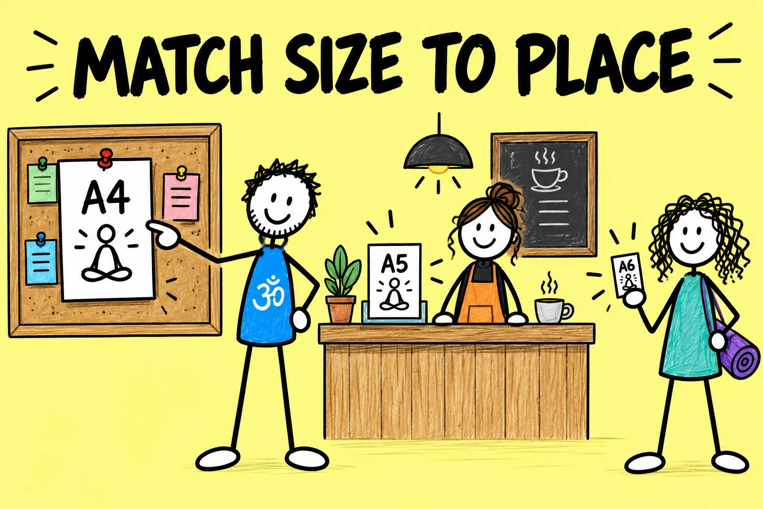
The location determines the useful format.
I created A4, A5 and A6 versions because they do different jobs. A4 can work on a noticeboard or window. A5 suits counters and handouts. A6 is convenient for a take-away card, but it gives every unnecessary sentence somewhere very small to hide.
- A4: noticeboards, windows and larger displays
- A5: reception desks, counters and class handouts
- A6: compact cards people can take away
Place flyers where suitable students already go and where the owner has agreed to display them: cafés, independent shops, community venues, libraries, clinics, workplaces or complementary local businesses. Relevance matters more than radius. A noticeboard three streets away can outperform one fifteen miles away if the right people actually look at it.
Use the Flyer to Start a Local Conversation
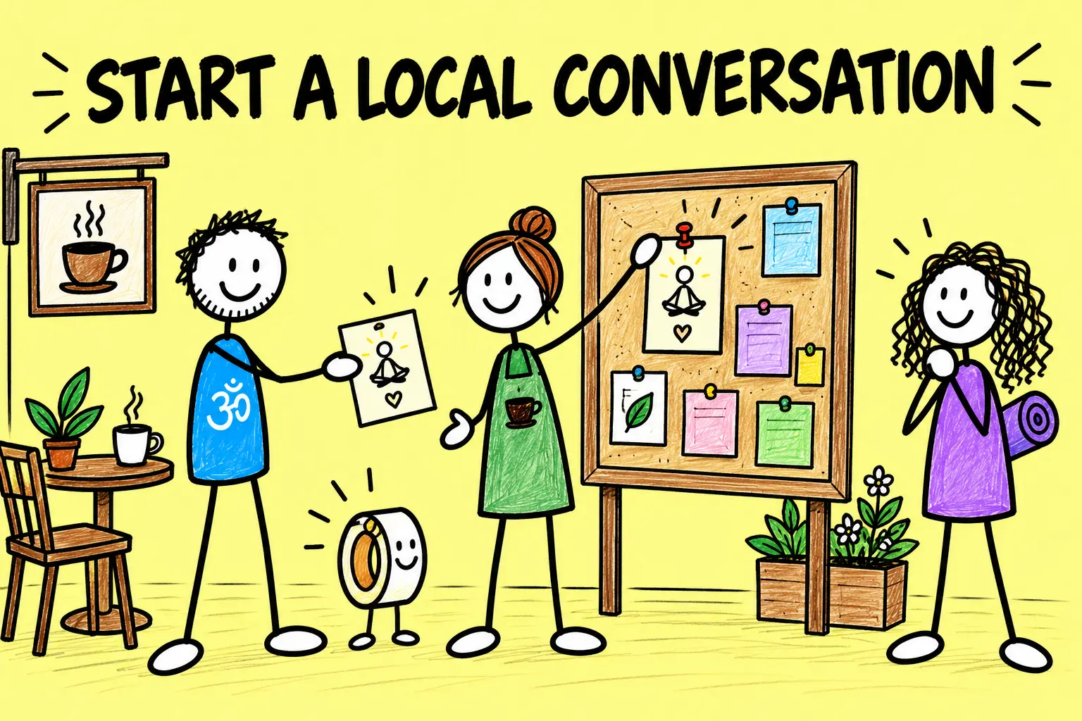
Ask before placing anything.
My most useful habit was visiting local businesses myself. I introduced myself, explained the nearby class and asked whether they would display the flyer. That gave the owner a reason to remember me and answer a customer’s question later.
A Simple In-Person Introduction
“Hi, I’m George, a local yoga teacher. I run a [class] nearby for [audience]. Would you be happy to display this flyer for a few weeks? It gives the dates, price and booking details. I’m also happy to take it down or replace it when the information changes.”
Tailor the explanation to the business without inventing benefits. Thank them, note the location and ask when old notices are cleared. Do not cover another organisation’s poster, block a safety notice or assume that a roll of tape constitutes planning permission.
Door-opener ruleThe flyer carries the details; the conversation supplies the trust.
Track a Small Print Test
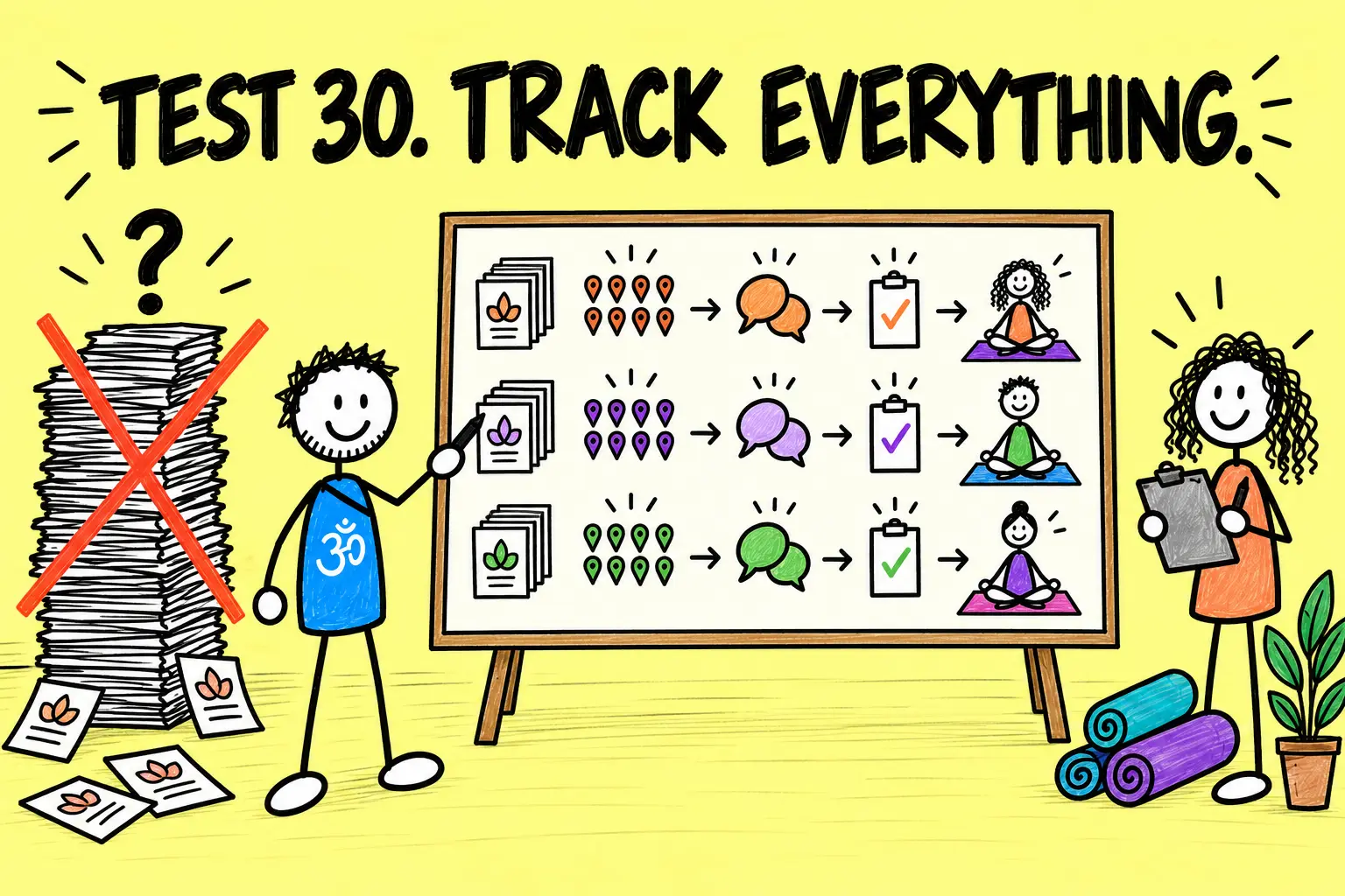
Print enough to learn, not enough to wallpaper Wales.
The old article told teachers to print 100 copies and repeat the exercise a year later. A better approach is a smaller, time-limited test with a review date.
- Record how many copies were printed
- List each agreed placement
- Add a simple source code or dedicated short link
- Use a trackable QR destination where appropriate
- Ask new students how they found the class
- Record enquiries, bookings and attendance separately
- Check which details caused questions
- Remove or replace outdated copies
My £10-per-month classified advert was not a flyer, but it produced roughly three to four new students a month and taught me the useful principle: offline marketing becomes much easier to judge when each source is recorded. The same discipline belongs on a flyer campaign.
After two to four weeks, compare placements and responses. Keep the message that earned suitable enquiries, change the part that caused confusion and stop printing the version that mainly generated attractive recycling.
Evidence ruleCount the path from placement to enquiry, booking and attendance.
A 30-Copy Yoga Flyer Test
1
Prepare
Create one flyer, one response route and a placement list.
2
Place
Ask ten relevant businesses to display three copies or formats.
3
Review
Check enquiries and bookings after two to four weeks.
Thirty measured flyers can teach you more than 300 pieces of untracked compost confetti.
Yoga Flyer Final Checklist
Use this before sending the file to the printer or introducing it to the office guillotine.
- 01
One offer
The flyer promotes one class, course or workshop.
- 02
Clear reader
The wording helps a suitable person recognise the fit.
- 03
Useful headline
The class, audience and place or time are obvious.
- 04
Complete details
Date, time, venue, price and booking route are accurate.
- 05
Honest claims
Benefits are specific, responsible and supportable.
- 06
Readable design
The headline, details and action have a clear hierarchy.
- 07
Tested route
The phone number, link and QR code work.
- 08
Measured test
Placements and responses have somewhere to be recorded.
Yoga Flyer FAQs
What size should a yoga flyer be?
Choose for the placement. A4 suits noticeboards and windows, A5 works well on counters or as a handout, and A6 can act as a take-away card. Print a full-size test before ordering.
What should the headline say?
Name the class in language a suitable student will understand. Add the audience, place or useful time detail when it improves the fit, such as “Beginners’ Yoga in Cardigan” or “After-Work Yoga on Tuesdays”.
Should I offer the first class free?
Only if it supports a deliberate offer and the terms are clear. A free class is not automatically more persuasive than a straightforward introductory price, and the CAP Code places specific requirements on use of the word “free”.
Should I include a QR code?
Use one if it gives the reader a genuinely easier route to current details or booking. Also print a short web address, test the destination on more than one phone and keep the landing page up to date.
How many flyers should I print?
Start with a quantity you can place thoughtfully and track. Thirty copies across ten relevant locations can provide a useful first test; the correct next print run depends on actual response and how quickly details change.
Can a yoga flyer make health claims?
Only make objective claims you can support and that comply with the advertising rules applying to your offer. Avoid suggesting that an ordinary yoga class cures, prevents or treats a medical condition.
Turn the Flyer into a Marketing Test
A well-designed flyer still needs a clear offer, suitable placements and a simple way to measure the response. The Yoga Marketing Kit helps you plan practical marketing experiments and keep the useful results.
George’s Conclusion
Flyers worked for me because I used them locally, repeatedly and personally. They gave nearby businesses something clear to display and gave me a natural reason to introduce the class.
The design matters, but the useful combination is simpler: one suitable offer, one readable flyer, one human conversation and one way to track what happened next. Start small, measure honestly and improve the next print run. The printer will cope with the suspense.